13. Scales and Transformations
L3 121 Scales And Transformations V3
DataVis L3 12 V2
Scales and Transformations
Certain data distributions will find themselves amenable to scale transformations. The most common example of this is data that follows an approximately log-normal distribution. This is data that, in their natural units, can look highly skewed: lots of points with low values, with a very long tail of data points with large values. However, after applying a logarithmic transform to the data, the data will follow a normal distribution. (If you need a refresher on the logarithm function, check out this lesson on Khan Academy.)
Example 1 - Scale the x-axis to log-type
# Necessary import

pokemon = pd.read_csv('pokemon.csv')
pokemon.head(10)

plt.figure(figsize = [20, 5])

# HISTOGRAM ON LEFT: full data without scaling
plt.subplot(1, 2, 1)
plt.hist(data=pokemon, x='weight');
# Display a label on the x-axis
plt.xlabel('Initial plot with original data')

# HISTOGRAM ON RIGHT
plt.subplot(1, 2, 2)

# Get the ticks for bins between [0 - maximum weight]
bins = np.arange(0, pokemon['weight'].max()+40, 40)
plt.hist(data=pokemon, x='weight', bins=bins);

# The argument in the xscale() represents the axis scale type to apply.
# The possible values are: {"linear", "log", "symlog", "logit", ...}
# Refer - https://matplotlib.org/3.1.1/api/_as_gen/matplotlib.pyplot.xscale.html
plt.xscale('log')
plt.xlabel('The x-axis limits NOT are changed. They are only scaled to log-type')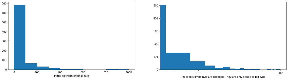
# Describe the data
pokemon['weight'].describe()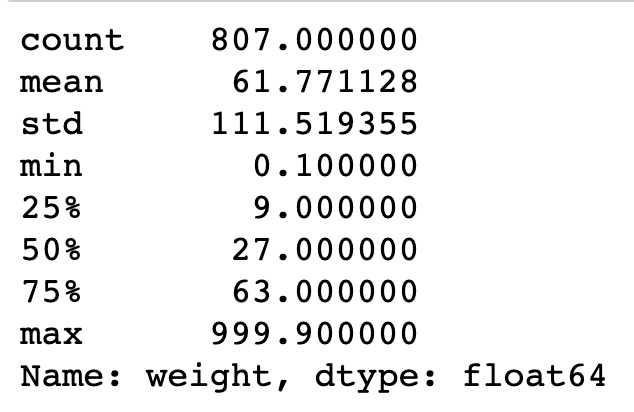
Notice two things about the right histogram of example 1 above, now.
- Even though the data is on a log scale, the bins are still linearly spaced. This means that they change size from wide on the left to thin on the right, as the values increase multiplicative. Matplotlib's
xscalefunction includes a few built-in transformations: we have used the 'log' scale here. - Secondly, the default label (x-axis ticks) settings are still somewhat tricky to interpret and are sparse as well.
To address the bin size issue, we just need to change them so that they are evenly-spaced powers of 10. Depending on what you are plotting, a different base power like 2 might be useful instead.
To address the second issue of interpretation of x-axis ticks, the scale transformation is the solution. In a scale transformation, the gaps between values are based on the transformed scale, but you can interpret data in the variable's natural units.
Let's see another example below.
Example 2 - Scale the x-axis to log-type, and change the axis limit.
# Transform the describe() to a scale of log10
# Documentation: [numpy `log10`](https://docs.scipy.org/doc/numpy/reference/generated/numpy.log10.html)
np.log10(pokemon['weight'].describe())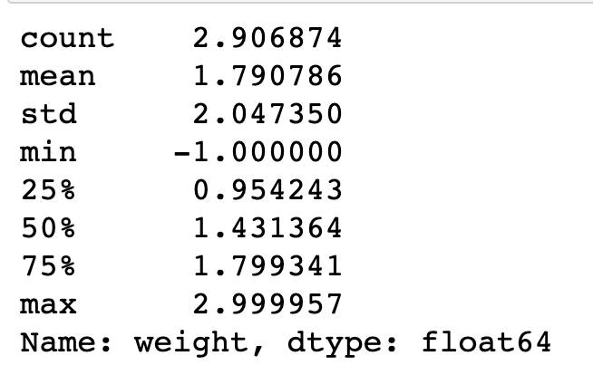
# Axis transformation
# Bin size
bins = 10 ** np.arange(-1, 3+0.1, 0.1)
plt.hist(data=pokemon, x='weight', bins=bins);

# The argument in the xscale() represents the axis scale type to apply.
# The possible values are: {"linear", "log", "symlog", "logit", ...}
plt.xscale('log')

# Apply x-axis label
# Documentatin: [matplotlib `xlabel`](https://matplotlib.org/api/_as_gen/matplotlib.pyplot.xlabel.html))
plt.xlabel('x-axis limits are changed, and scaled to log-type')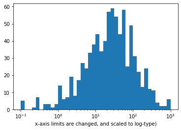
Example 3 - Scale the x-axis to log-type, change the axis limits, and increase the x-ticks
# Get the ticks for bins between [0 - maximum weight]
bins = 10 ** np.arange(-1, 3+0.1, 0.1)

# Generate the x-ticks you want to apply
ticks = [0.1, 0.3, 1, 3, 10, 30, 100, 300, 1000]
# Convert ticks into string values, to be displaye dlong the x-axis
labels = ['{}'.format(v) for v in ticks]

# Plot the histogram
plt.hist(data=pokemon, x='weight', bins=bins);

# The argument in the xscale() represents the axis scale type to apply.
# The possible values are: {"linear", "log", "symlog", "logit", ...}
plt.xscale('log')

# Apply x-ticks
plt.xticks(ticks, labels);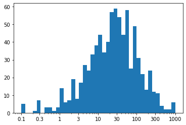
Observation - We've ended up with the same plot as when we performed the direct log transform, but now with a much nicer set of tick marks and labels.
For the ticks, we have used xticks() to specify locations and labels in their natural units. Remember: we aren't changing the values taken by the data, only how they're displayed. Between integer powers of 10, we don't have clean values for even markings, but we can still get close. Setting ticks in cycles of 1-3-10 or 1-2-5-10 are very useful for base-10 log transforms.
It is important that the
xticksare specified afterxscalesince that function has its own built-in tick settings.
Alternative Approach
Be aware that a logarithmic transformation is not the only one possible. When we perform a logarithmic transformation, our data values have to all be positive; it's impossible to take a log of zero or a negative number. In addition, the transformation implies that additive steps on the log scale will result in multiplicative changes in the natural scale, an important implication when it comes to data modeling. The type of transformation that you choose may be informed by the context for the data. For example, this Wikipedia section provides a few examples of places where log-normal distributions have been observed.
If you want to use a different transformation that's not available in xscale, then you'll have to perform some feature engineering. In cases like this, we want to be systematic by writing a function that applies both the transformation and its inverse. The inverse will be useful in cases where we specify values in their transformed units and need to get the natural units back. For the purposes of demonstration, let's say that we want to try plotting the above data on a square-root transformation. (Perhaps the numbers represent areas, and we think it makes sense to model the data on a rough estimation of radius, length, or some other 1-d dimension.) We can create a visualization on this transformed scale like this:
Example 4. Custom scaling the given data Series, instead of using the built-in log scale
def sqrt_trans(x, inverse = False):
    """ transformation helper function """
    if not inverse:
        return np.sqrt(x)
    else:
        return x ** 2

# Bin resizing, to transform the x-axis
bin_edges = np.arange(0, sqrt_trans(pokemon['weight'].max())+1, 1)

# Plot the scaled data
plt.hist(pokemon['weight'].apply(sqrt_trans), bins = bin_edges)

# Identify the tick-locations
tick_locs = np.arange(0, sqrt_trans(pokemon['weight'].max())+10, 10)

# Apply x-ticks
plt.xticks(tick_locs, sqrt_trans(tick_locs, inverse = True).astype(int));
Note that data is a pandas Series, so we can use the apply method for the function. If it were a NumPy Array, we would need to apply the function like in the other cases. The tick locations could have also been specified with the natural values, where we apply the standard transformation function on the first argument of xticks instead. The output transformed-histogram is shown below:
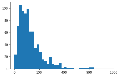
Histogram based on the custom scaling the given data Series